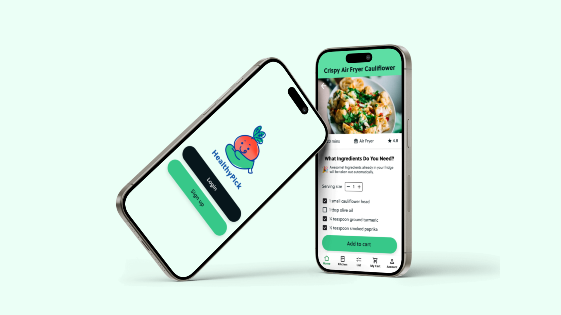
HealthyPick App
A recipe and delivery platform that takes a look at your fridge inventory while helping you find and make quick recipes
Project type:
Student work, End-to-end
Role:
Product, UX/UI, Research
Timeline:
Summer 2023 (6 months)
Overview
At the beginning of 2023, I left my job to take care of my family. I had always wanted to take the leap from visual design to UX/UI design, so in March, I started my certification program in UX & Visual Interface Design at the University of Washington.
My final project revolves around nutrition and healthy eating. The topic is close to my heart since I’ve had personal experience as a caretaker of my family, especially with my grandma, who has heart condition, and my father, who was diagnosed with pre-diabetes.
The Problem
People don’t get enough of their daily nutritional needs through consuming meals throughout the day
America is still one of the least healthy nations in the world. Most of the food we eat is packed with empty calories that make us crave more instead of consuming nutrient-rich foods that our bodies recognize when we have eaten enough. The benefits of eating whole foods instead of vitamins and supplements are clear, but which foods and how much?
The Solution
HealthyPick App: Connect with your fridge and local grocery stores
A platform that helps save time and stress in the kitchen by offering a library of healthy recipes made under 20 minutes and delivers prepared ingredients in exact amounts while knowing what is in your fridge.
Research
Identifying the Problem
I conducted one-on-one interviews with 16 people from different backgrounds and ages (18 to 48) to understand their knowledge level of what whole foods are, what they typical eat in a meal, eating habits, and find any challenges/pain points they face when trying to eat enough of their daily nutrition.
Insights
88% of users…
feel they lack time to search for recipes, shop for groceries, and cook a healthy meal
lack motivation to cook something and would rather will want to grab something quick, such as microwavable foods or some toast
are overwhelmed by the sheer number of recipes on the internet
leave produce in the fridge for too long causing food waste and wasted money
desire to eat healthy so they can feel more energy throughout the day
Competitive Analysis
Ideation workshop
I took the insights and made HMW statements to use for my ideation workshop initiated with four people. This really created a variety of different solutions for different services and spaces.
Wireframes
Designing the Concept
I used simple wireframes to test my concept, allowing me to identify what was effective and where improvements were needed.
Then mid-fidelity wireframes were transformed into a functional prototype to evaluate user interaction with the screens and features.
Final Design — Key Features
Recipe Search Engine
On the home screen of the platform, you’ll be able to find recipes with ease by searching by ingredients and/or by health concerns (for example: ‘diabetes’ or ‘high cholesterol’). Feel free to enter more than one keyword in the search bar.
Digital Kitchen
Record what ingredients you may already have in your fridge or overall kitchen. Options to connect to a smart fridge, fridge camera device, or just manually scan products via a phone camera. In addition, you’ll able to find recipes by selecting foods in the digital kitchen.
Ingredients Ordering Service
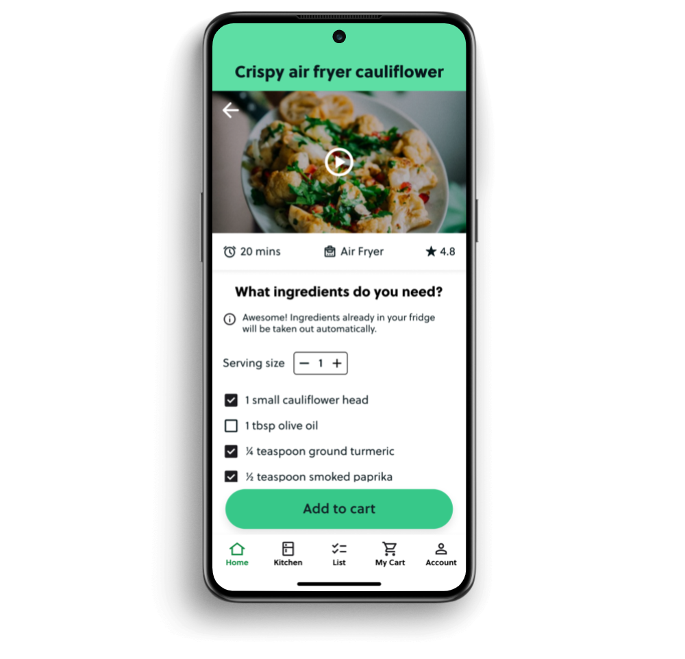
Choose a recipe you'd like to prepare, then have the ingredients delivered to your door or ready for pickup. If you've connected your fridge or fridge cam in your 'Digital Fridge', the app will automatically exclude any ingredients you already have, making the ordering process seamless. You can also adjust quantities based on serving sizes.
Personalization
Set up your profile by answering a few questions about your health, food restrictions, and dietary preferences. This information helps tailor the recipe search engine to your specific health needs.
Visual Design
Style Guide
Reflection
What I learned
The six months working on this from start to finish was truly an experience that honed my skills as a designer, especially as it being my first UX project. I learned how to conduct interviews using the right questions, facilitate usability testing sessions, learn the basics of UX design principles, create a working prototype within Figma, and collaborated with other designers. Although the process seemed linear, it was definitely not the case.
Learning from a class-based setting with 3 separate courses throughout the months required going back and forth between research. The first course required us to learn the research aspect of a UX designer, while the second and third started getting us accustomed to applying that research into feasible concepts and designs. Much of this was a very confusing process that I had to remember back while I was in the designing phase, what I did in the research phase two months ago. In conclusion, documentation is so so important! Recordings, old figjam files, notes, and so on.
Things to improve for next time
If this wasn’t a class with limited time, I would like to work on multiple research methods so I have more diversified data to work off of. It felt too linear and we did not record data on age ranges.
Record every part of the testing, conceptualizing, and workshops.
Pick less features for the first round and think about adding more for next time. Being the first UX design I was overwhelmed with the feature options I had that I feel as though I may have added too many.
Moving forward
Develop and finalize all the screens and interactions for a working product.
Create a better visual branding for all illustrations.
Test with more users to see interactions with features and if it helps them.


