Role
Graphic Design
Logo Design
Art Direction
Team
Jessica Ye (Designer)
Dylan Hoff (Copywriter)
Sherelle Williams (Producer)
Colin Sulgrove (Photographer)
Boelle Bonadonna (Stylist)
Timeline
Feb 2020 (2-3 weeks)
The Brief
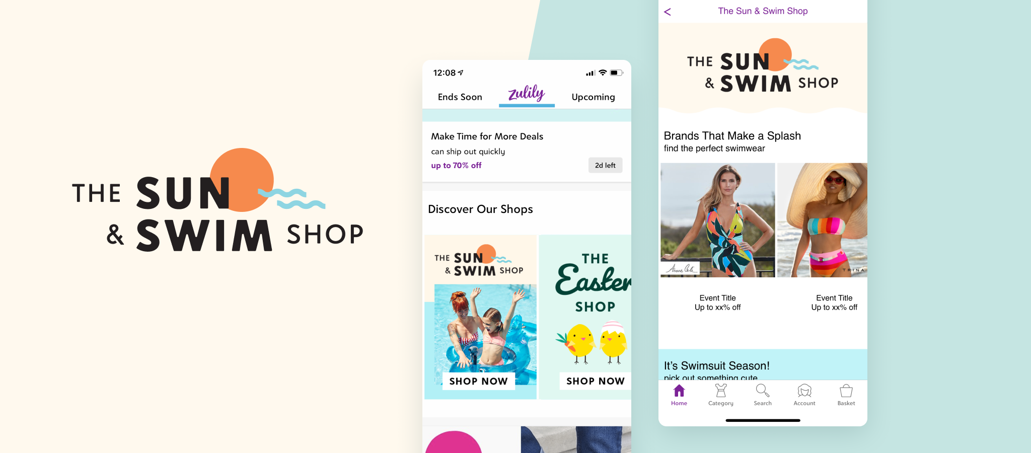
For the past 6 months, Zulily has been introducing category shop projects to our team every 2-3 weeks. This time around, a request from the merchandising team was submitted to our design team for a summer apparel shop page to be featured on the Zulily homepage. Their ask was to make this "bold" and "fun" to match the summer vibe. This shop page would include products like swimsuits, swim accessories, and toys.
The Challenge
The concept of category shops was relatively new to our team. Therefore, we were still establishing processes. It necessitated the creation of a logo design from scratch, but it needed to align closely with the Zulily brand. Consistency was also required within the assets and in-house photography. Therefore, the project involved significant collaboration between myself, the creative manager, merchandising, and photographers.
Moodboard
I began by examining established swimwear brands and competitors with strong branding that had a similar feel of what our team was going for. "Fun" and "bold" were key descriptors in the brief, so I also assembled a moodboard of lively logo designs, typography, and colors.
Colors
The color palette was composed of vibrant hues that embodied the spirit of "Summer". It had to complement the imagery well. We avoided an excess of blue, as many of the in-house photos featured blue water. Consequently, a majority of the colors were chosen to contrast effectively.
Typeface
I discussed potential typefaces with my Creative Manager. Initially, we explored various options, but we eventually chose Belltown, Zulily's typeface, for several reasons:
Zulily aimed to maintain consistency in its style guide.
The ease of adjusting a sans-serif font for logo design.
It matched well with the aesthetics and image of the shop.
The Design Process
The logo had to be simple enough that it didn’t take too much away from the imagery that was being shot in-house. This was where I started exploring what matched better together in terms of fonts. In the end, san serif was the winner. Serifs interrupted the simplicity of the shapes used.
Creative Review
It took about 3 rounds to finalize the logo. The first two rounds were with the lead designer and creative director. Afterwards, I presented the final deck (with all assets) to other stakeholders, such as the merchandising team.
Asset Creation
A set of banners had to be created for the category shop page, homepage, and emails.
Streamlining the Design Process + Production
While discussing new ways to enhance our design processes, I proposed using Adobe XD as a tool to explore how we can visualize the interaction of the designs created by the team. This was because all the review decks were made in InDesign, making it challenging for stakeholders to understand how the designs would look together on the live page. It was the first time we used Adobe XD to create an interactive prototype of the homepage and shop page. Subsequently, it was decided that I would lead a lunch and learn session for those interested in learning more about the application.
Reflection
There were times when I was designing, and I was too focused on making the logo look unique. I experimented with replacing letters in the word "Swim" to create a graphic of a wave, thinking it would make it look more interesting. However, I realized that it wasn't necessary, especially since it might detract too much from the overall logo and the Zulily brand.
Currently, motion plays a significant role in design trends. So, next time, I'd like to try animating the logo to make it more interactive for customers.
The Results
The Sun & Swim Shop continues to be a popular category for customers. The design has been reformatted, but it still incorporates the same elements and logo that I created during my time at Zulily.


